Here are a couple of online explanations that help you visualize what ordinary least squares regression does. The first one has snazzy dials. The second one is especially good for playing with getting to least squares.
.

Here are a couple of online explanations that help you visualize what ordinary least squares regression does. The first one has snazzy dials. The second one is especially good for playing with getting to least squares.
.
We’ll start in on Pearson’s r this week. I am contractually obligate to say at least three times each semester, “correlation does not equal causation.” That’s one. Check out this entertaining collection of spurious correlations.
Click the picture to see an interesting data visualization about how men and women tend to describe colors.

We’ll discuss this Guardian article a bit in class this week: “Women Are Happier Without Children or a Spouse, Says Happiness Expert.”
Check out Dear Data, the wonderful project two women undertook to collect data about their lives and communicate their findings on the back of postcards. One of my favorite exercises in data visualization ever.

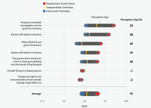
Last night we discussed how poorly Democrats and Republicans understand each other’s positions, and how a little good quantitative data might go some way toward helping partisans on both sides see that they are more alike than they believe. Here’s some such data from More in Common.

You can discover lots of fascinating social patterns with simple counts and ranks. Check out the patterns discoverable in Social Security Administration records on names parents give their children: “How to Name a Baby.”

Check this space often for updates, links, assignments, etc.
The book you will need right away is:
Levin, Jack, James Alan Fox, and David R. Forde. 2014. Elementary Statistics in Social Research, Twelfth Edition. Boston: Pearson.